Aaro Capital Market Outlook Summer 2023
Introduction
Following all-time highs in November 2021, the crypto market retracted in May and June 2022, hitting the mainstream media for all the wrong reasons. Our research suggests that the cascade in selling was primarily driven by the LUNA stablecoin collapse and its contagion effects on highly leveraged crypto players and shadow banking counterparties. The largest casualty was Three Arrows Capital, a proprietary crypto fund, which at its peak managed more than $15bn.
In this article, we investigate the historical occurrence of crypto market cycles, where we are now in the market cycle after the large drawdown, and what the likely key drivers are looking forward.
Overall, the data is consistent with previous crypto market cycles. If the crypto market evolves in a similar fashion to that of previous cycles, we can reasonably expect that we are now in a transition phase out of the 2022 bear market and into the next bull market.
Further, while many have focused on macroeconomic narratives to explain crypto’s recent price action, deeper analysis of crypto market data suggests that market movements have been, and are still likely to be largely independent of current macroeconomic conditions.
Crypto market cycles
The crypto market has exhibited four-year market cycles since its inception in 2008, each characterised by parabolic market peaks and severe bear markets. These cycles have roughly followed Bitcoin's “halving” events, which halve the rate of new supply. Together with the market dominance of Bitcoin, typically constituting of halve or more of the crypto market by market capitalisation, and the fact that it has the longest track record, Bitcoin is commonly used as a barometer of the whole crypto market. We therefore focus primarily on Bitcoin for our analysis. This is akin to using the U.S. economy as a barometer for the health of the world economy.
We are approaching the end of the third crypto market cycle (using reliable trading prices), with the next Bitcoin halving projected for April / May 2024. Historically, crypto bull markets have started more than a year before the halving event, possibly driven by anticipation of lower future supply and the completing of the washout of the previous market cycle.
To understand where we are in the current market cycle, we need to form a rounded view of market health based on a variety of data points that establish a consistent narrative.
A key difference between crypto and traditional markets is the transparency of blockchain data, which provides the ability to recognise patterns and behaviours of users via transaction data. This data is also referred to as “on-chain” data.
We can use on-chain data to identify patterns and help determine the current stage of the crypto market, as well as how it may develop in the future. Though history does not repeat itself, it tends to rhyme.
Looking at crypto cycles from a very high level view, Bitcoin tends to lead the rest of the market out of the bear trend and into an early bull trend. This can be seen when looking at Bitcoin’s market dominance vs the rest of the crypto market. Red zones highlight times when Bitcoin dominance went over 50%.
Figure 1: Bitcoin Market Dominance
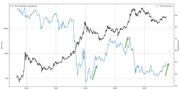
The market was almost entirely Bitcoin in 2015 with no meaningful trading volume. Since then, we have been able to observe several patterns:
1.Bitcoin tends to recover first from bear markets, shown with its increasing dominance.
2.Bitcoin tends to lag the market in the later stages of a bull market.
3.Bitcoin tends to fall less in bear markets, again increasing its relative market dominance.
Bitcoin’s dominance is showing signs of increasing again, similar to previous transitions out of bear markets.
Has the market bottomed?
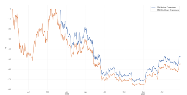
Since the Bitcoin all-time high in November 2021, it appears as though we have been a market drawdown for ~560 days. On-chain activity, which peaked in April 2021, suggests an even longer period of approximatly 770 days. We distinguish between on-chain and actual (price) drawdowns below.
Figure 2: Bitcoin On-chain vs Actual Drawdowns
To assess the severity of the current drawdown compared to previous cycles, we examine historical bottoms. We analyse price movements 365 days (1 year) before and after each bottom.
Figure 3: Movements Before and After Bottoms
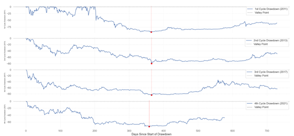
The timing and severity of the current drawdown appears to be in line or generally better than history. By this point in the cycle, most drawdowns have reached their lowest point, and this seems to be the case now. To confirm this, we can refer to a range of additional metrics to provide further insight.
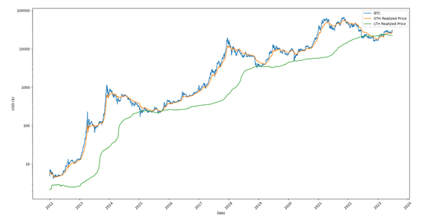
The first measure of market health to consider is the unrealised profit and loss of market participants. An investor who is sitting on large profits will often act differently to someone who is sitting on large losses, especially if they have liabilities to manage.
To measure this, we can analyse the price at which an investor’s Bitcoin was last transacted on-chain (i.e. the price at which they were transferred). This can be used to approximate the price at which investors bought their current holdings. This concept is known as the “Realised Price”.
By comparing the Current Price (i.e. the market price) to the average Realised Price of the market, we can identify periods in which the Current Price is lower than the average Realized Price, hence on average, when holders are subject to an unrealised loss. Historically, there have been only a few periods in each market cycle where this has occurred, all of them previously proving to be value zones for Bitcoin and usually occurring during late-stage bear markets.
Figure below shows Bitcoin’s price in blue and Realized Price in orange, while the green vertical bars highlight the zones where Bitcoin’s price was lower than the Realised Price.
Figure 4: Bitcoin's Realised Price
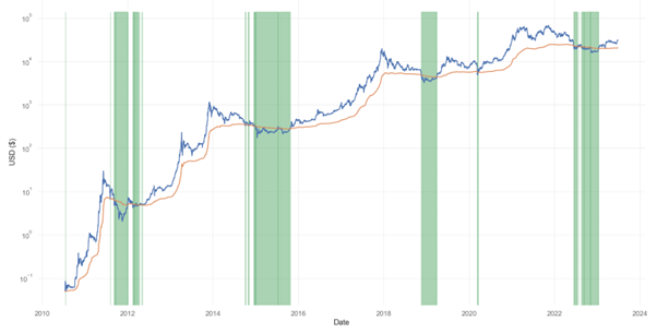
Bitcoin’s price went below its realised price for a substantial amount of time in 2022, before recovering at the start of 2023. This is consistent with previous market bottoms.
Late-stage bear markets are where the final market bottom is established. The market dynamics of late-stage bear markets are similar regardless of asset class. They are largely driven by the same human emotions of extreme fear, where there appears to be no end to bad market news.
The second key driver of late-stage bear markets is the dynamic between sellers, who are the so-called “weak hands” and the buyers, so-called “strong hands”. Weak hands are those who have lost conviction, who just want to get out to limit their losses or are forced sellers due to their difficult financial situation.
The buyers in these markets are strong hands whose conviction remains and can afford to risk further losses in the short term in return for larger profits in the medium to long term. The market cycle bottom arises when the weak hands run out of Bitcoin to sell.
This causes prices to create a “U” shaped bottom where price starts to increase gradually as the strong hands continue to buy.
A commonly used proxy for strong hands in the data are “Long Term Holders”, identified as entities who have held Bitcoin for more than 155 days. Past this point, holders of Bitcoin tend to have stronger long-term conviction and are less likely to sell in the foreseeable future.
Long Term Holders tend to be more sophisticated investors who usually sell at higher prices and buy at lower prices. They do this by accumulating Bitcoin during times of market weakness and gradually selling during strong bull markets.
We can break-out the realised price for both long term and short term holders.
Figure 5: Realised Price for Long / Short Term Holders of Bitcoin
The Long Term Holder realised price (green line) went above the Short Term Holder realised price (orange line) in 2022, before reverting again recently in 2023.
The Bitcoin price tends to be above the short term holder realised price during peak bull markets, where it acts as a support as people buy the dip, and below during bear markets where it acts as a resistance as people sell as soon as they break even. This can be seen in the plot below.
Figure 6: Realised Price for Short Term Holders of Bitcoin
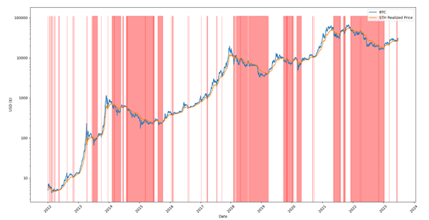
Red zones in the chart above indicate times when short term holders realised price exceeds the Bitcoin price. A consistent red zone is pertinent during bear market phases. Currently, we moved from such a phase at the start of 2023. Once we see the short term holder realised price change from a price resistance to a price support, meaning a change in investor mentality from sell at breakeven price to buy the dip, it tends to remain in this regime for an extended period of time.
We can also use the Realised Price to determine whether Bitcoin appears to be under or overvalued. The Market Value Realized Value (MVRV) Z-score is used to assess when Bitcoin is either over or undervalued relative to its historical “fair value”. It is calculated using the following formula:
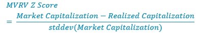
Figure below shows the MVRV Z-score and the Bitcoin price. The MVRV Z-score value in the “green zone” highlights periods when Bitcoin was undervalued based on historical norms and has signalled market bottoms. Similarly, Z score values in the “red zone” highlights periods when Bitcoin was overvalued relative to historical norms and has signalled market tops.
Figure 7: Bitcoin’s MVRV Z-Score
This metric hit its 'undervalued zone' (i.e. the green zone in the plot above) in 2022 and is now meaningfully above those levels after a capitulation of the market in late 2022 and the price rally in 2023.
Looking at the same realised price data, we can also calculate what percentage of all Bitcoins are being held at an unrealised profit or loss. The percentage supply in profit can be used as a proxy for market sentiment and financial distress, which are important drivers of market cycles, and has historically acted as a good indicator for identifying market tops and bottoms.
Generally, when more than 95% of the supply in profit, it indicates that the market is closer to its cycle top, while less than 50% of supply in profit tends to indicate market bottoms. The figure below shows the percentage of supply held in profit relative to price.
Figure 8: Percentage of Bitcoin Supply Held in Profit
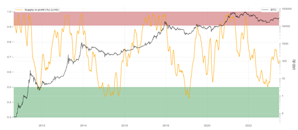
Bitcoin supply held in profit also seemingly bottomed out in 2022 and currently indicates that over 70% is in profit.
To ensure robustness, we should look at this data in different ways to ensure it yields a consistent message. We can also examine the actual USD value at which each Bitcoin is in unrealised profit or loss. This is known as the Net Unrealized Profit / Loss (NUPL).
Figure below shows NUPL and price. The green vertical lines identify where the unrealised loss is greater than the unrealised profit, which have historically been value zones.
Figure 9: Bitcoin's Net Unrealized Profit/Loss and Price

Bitcoin Net Unrealised Profit / Loss experienced multiple value zones in mid to late 2022, i.e. when unrealised loss is greater than the unrealised profit. The current value is close to 0.5.
In terms of realised profitability, the chart below highlights the volume of losses and profits being transacted on-chain. Times when on-chain losses consistently exceed on-chain profits (red zones), are usually the peak bear market zones.
Figure 10: Bitcoin Moving P&L
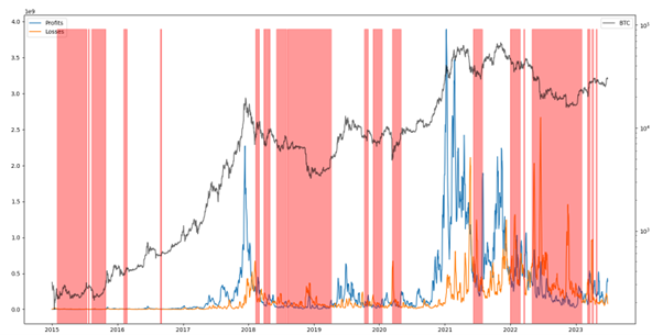
A market recovery is often indicated by the decrease in frequency and consistency of the red zones. We are currently in such a period.
We can also identify specific types of Bitcoin holders. One group of holders which are of specific interest are Bitcoin miners. Miners are commonly referred to as insiders as they generally have a deep understanding of the technicals of Bitcoin, knowledge on the state of the ecosystem, and have been in the market across several cycles.
They are classified as compulsory sellers as they have fixed mining costs to cover and their profitability plays an important part in shaping market cycles. The Puell Multiple (shown below) shows the daily coin issuance by miners divided by the one year moving average:

The green zone indicates a low Puell Multiple, where Bitcoin miners are selling less than average revenues in USD terms, which can be used as a proxy for potential financial stress of miners. Low Puell Multiples have historically occurred during late-stage bear markets with the exception being in mid-2021, which was due to the mining migration out of China following the formal mining ban.
Figure 11: Bitcoin Puell Multiple
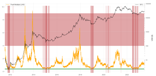
2022 saw the Puell Multiple hit the green zone, before recovering in late 2022 and early 2023.
Hash Ribbon is a market indicator that identifies likely financial stress in the Bitcoin mining industry by looking at downward trends in moving averages of the Bitcoin hash rate. When the slower moving average, the 60-day moving average of Bitcoin’s hash rate, crosses above the faster moving average, the 30-day moving average, its commonly used as a flag for financial stress in the Bitcoin mining industry.
This is shown in the Figure below. Green vertical zones identify the aforementioned scenario and have historically generally identified Bitcoin value zones.
Figure 12: Bitcoin Hash Ribbon
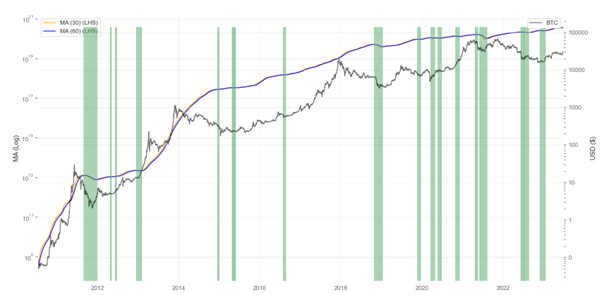
Hash Ribbon seemingly bottomed out in late 2022.
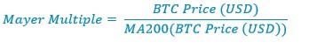
A more traditional way of accessing market health is technical analysis, which attempts to understand at what price the market is willing to buy and sell, and by how much. Technical indicators based on price data provides further information which can be used to identify overbought or oversold conditions for Bitcoin. One such indicator is the Mayer Multiple, which takes the current price of Bitcoin and divides it by the 200-day moving average.
The green vertical lines in figure below highlights the minimum value of the Mayer Multiple over previous Bitcoin halving cycles, including the current one.
Figure 13: Bitcoin Mayer Multiple
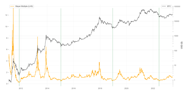
The Mayer Multiple bottomed out for the current cycle in 2022.
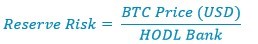
The primary driver of buying and selling decisions by Long Term Holders is the risk level and the reward they earn as compensation. The risk / reward ratio for them could enable us to pinpoint the prices at which they generally tend to buy or sell. Reserve Risk is a metric that is used to assess the confidence of Long Term Holders relative to the price of Bitcoin at any given point in time. This is done via calculating the cumulative opportunity cost for holding Bitcoin vs selling Bitcoin for these holders.
The figure below shows the Reserve Risk and Bitcoin prices. The red vertical zones highlight the times when Reserve Risk fell into the value zone and therefore the risk / reward ratio is extremely high. These periods have historically coincided with late-stage bear markets, which have presented good value opportunities over the market cycle.
Figure 14: Bitcoin Reserve Risk
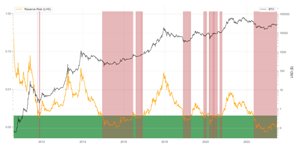
These periods have historically coincided with late-stage bear markets, which have presented good value opportunities over the market cycle. Currently, the Reserve Risk is in a value zone. Reserve Risk bottomed out in late 2022, although still remains in the value zone.
Another popular technical indicator which is used to identify market bottoms is the Bitcoin price 200-week Moving Average. The green vertical lines in the figure below highlight when the current Bitcoin price has gone below the 200-week Moving Average, which have historically been extreme value opportunities.
Figure 15: Bitcoin 200 Week Moving Average
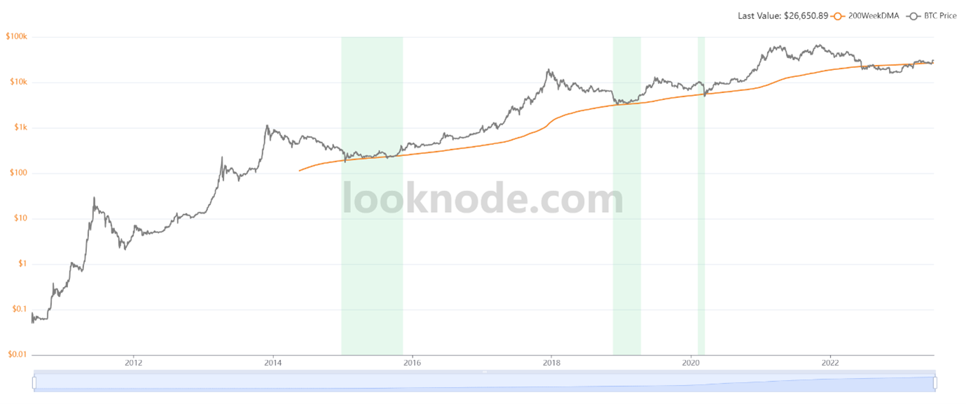
The price recovered above the 200-week moving average in March 2023.
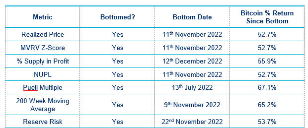
Below is a tabular summary of the metrics and whether they have bottomed out or not.
Table 1: An Overview of Market Bottom Indicators
Glassnode released a confluence summary metric which combines on-chain and technical indicators to get a rough idea of whether market is recovering from a Bitcoin bear market. Green zones indicate spot prices are trading above key pricing models (both technical and on-chain).1
Figure 16: Bitcoin Confluence Summary
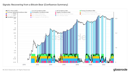
The chart turns dark blue when all eight indicators are triggered, which happened in April 2023.
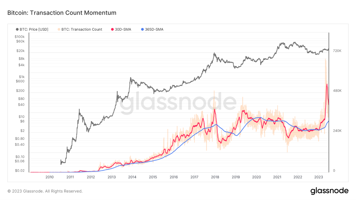
Overall, Bitcoin has seen a strong uptick in on-chain activity but it is important to note that most of this is coming from a rapid increase in the use of the relatively new BRC-20 standard and text inscriptions (oracles), instead of traditional Bitcoin transfers. This is evident by the pickup in transaction count, highlighted by the 30 days simple moving average (red line) below. A bullish trend is observed when the 30 days simple moving average goes above the 365 days simple moving average and vice versa for bearish trend.
Figure 17: Bitcoin Transaction Count Momentum
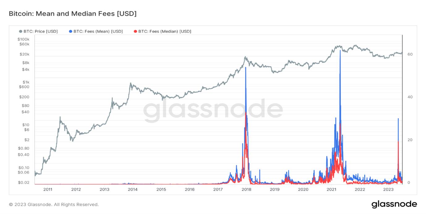
Miners have seen a large pickup in fees earned in the form of transaction fees paid by users wanting to process transactions on the Bitcoin network, due to network congestion. This means parties are actively using the Bitcoin network and willing to pay high fees for this service, meaning it is of economic value to them.
Figure 18: Bitcoin Mean and Median Fees (USD)
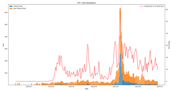
This pickup in transaction fees is mostly explained by the popularity in ordinal fees, which is shown below.
Figure 19: Bitcoin Ordinal and Non Ordinal Fees
Where are we heading this year?
If we see a continuation of the above data, this would be consistent with the transition period out of a bear market and into the next bull market, with timing consistent with previous four-year crypto market cycles. We would want to see a continued apparent regime change from bear market to an early stage bull market. We can further look at the behaviour and profitability of entities on-chain to see how they are reacting to the current price changes.
Looking at the behaviour of Bitcoin Long Term Holders, they have started selling their holdings over the past month, which is generally behaviour consistent with an early bull market.
Figure 20: Bitcoin Long Term Holders Accumulation
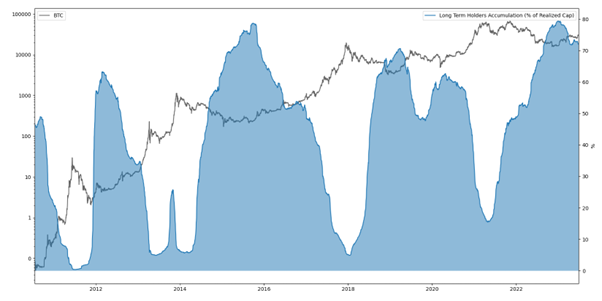
Long Term Holders continued to accumulate post August 2022 and started reducing their holdings at the start of 2023 as the price rally took hold.
We can break down the buying and selling activities of entities by their age to determine who is currently buying or selling and this what motives may be behind their trading.
Figure 21: Bitcoin Holders Accumulation Breakdown - By Age
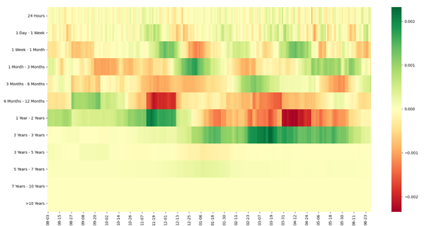
The general trend in the market for long-term holders does seem to be accumulation, with the selling seemingly coming from 1 Year – 2 Years holders, mostly entities who were previously holding Bitcoin at a loss and are now selling their holdings around their break-even price.
We can verify this by looking at the profitability of Long-term Holders i.e. the Long Term Holders Spent Output Profit Ratio (SOPR).
Figure 22: Bitcoin Long Term Holders Spent Output Profit Ratio
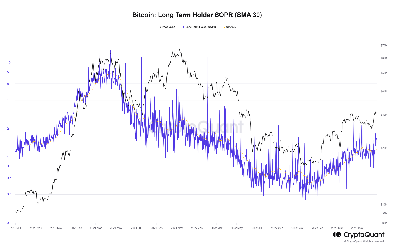
SOPR essentially takes the price sold over price paid by long term holders. A value over one indicates profitability while a value below one indicates losses for long term holders. The Long Term Holders SOPR went below 1 around May 2022 and has recently returned back above 1 in April 2023.
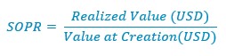
A key determining factor of price is how willing current holders of Bitcoin are to sell. The less current holders are willing to sell, the less liquid supply is and the less supply there is on the market. If market supply is constrained, this helps to support price.
We can analyse this by looking at when Bitcoins last moved. The supply last active for different age bands indicates a lack of availability of liquid supply. This suggests demand and conviction among longer term investors.
Figure 23: Bitcoin Supply Last Active Age Bands
The chart above shows that Bitcoin is the most liquid it has ever been, with the latest share of the total Bitcoin supply on record not having moved for one or more years.
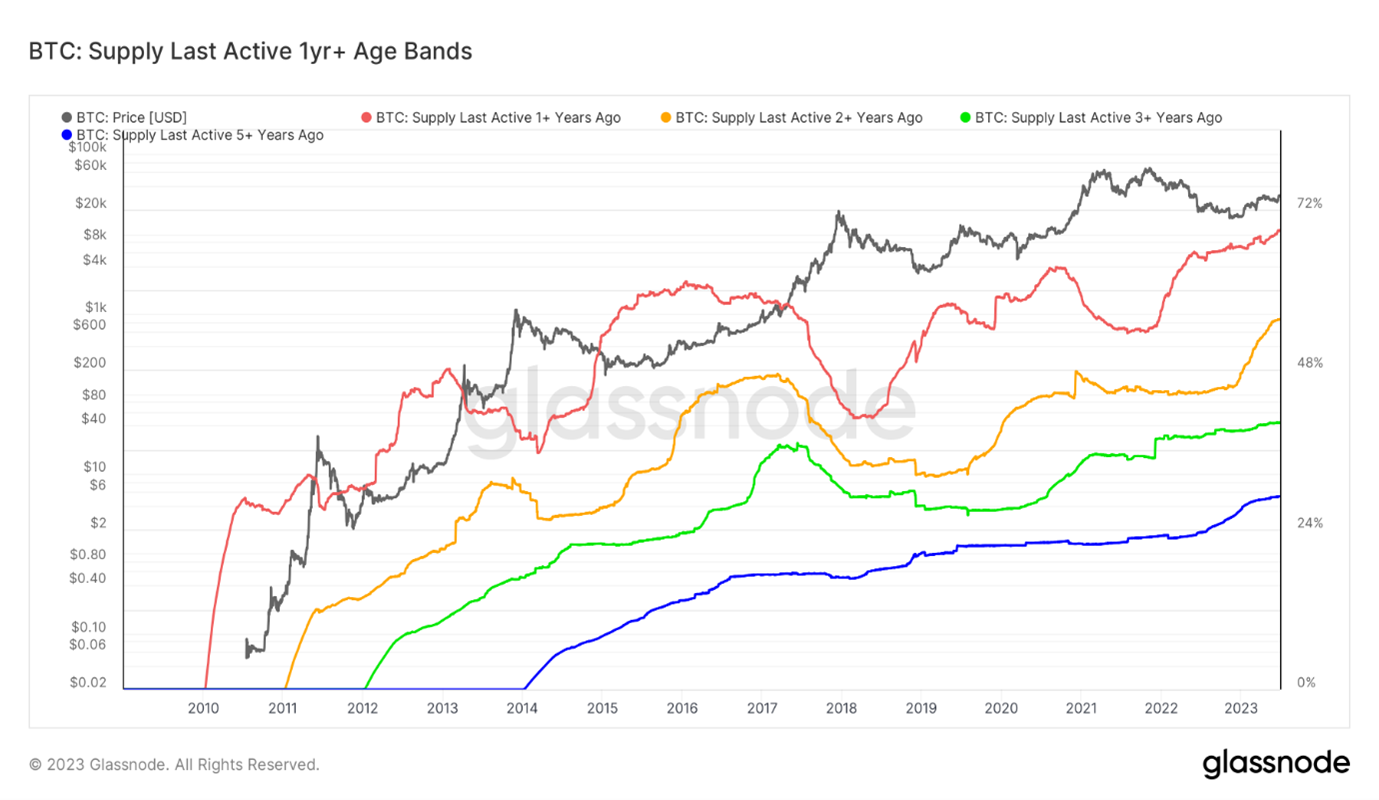
In terms of liveliness of Bitcoin, i.e. whether the entities are generally selling or accumulating, we can see in the chat below that ‘hodling’ has been the primary market dynamic since around the market peak in November 2021.
Figure 24: Bitcoin Liveliness
Bitcoin is the most illiquid it ever had been, which suggests strong longer term demand and price support.
Looking at Bitcoin miners, we can determine whether miners are generally in financial difficulty at any given time in the market via the Miner capitulation tracker. Miner capitulation refers to periods where miners are forced to sell their holdings, leading to increased selling pressure of Bitcoin in the market. It also correlates strongly with forced selling of other service providers in the crypto space.
Miner capitulation tracker includes three miner metrics: Puell Multiple, Miner Rolling Inventory and Hash Rate Moving Average.
Red zones indicate all three metrics are bearish, i.e. indicating capitulation. Yellow zones indicate two or more metrics are bearish while green zones indicate less than two metrics are bearish. The difficulty regression price (purple line) aims to calculate the cost of mining based on mining difficulty for the miners i.e. aims to get a minimum price needed to cover mining costs.
Figure 25: Bitcoin Miner Capitulation Tracker
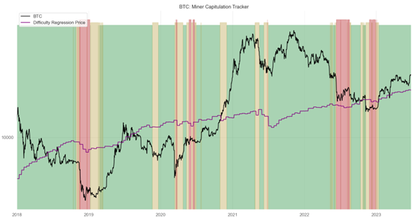
Miners capitulated in mid to late 2022 but have recovered since the start of 2023 and the Bitcoin price has been above the difficulty regression price since early 2023.
Difficulty regression price assumes mining difficulty incorporates all costs incurred by miners to maintain their mining operations. Hence, if the actual price for Bitcoin is above the difficulty regression price, it indicates that miners should be profitable and able to sustain their mining operations.
Trading Volumes for Bitcoin can act as a good proxy for market activity via both institutions and retail. As the crypto market cycle enters a bullish phase, the spot volumes across exchanges are expected to pick up and showcase more upward momentum while bear markets usually result in typically low volumes with no sign of pickup.
In spite of the positive on-chain metrics, trading activity has been rather muted.
Looking at BTC-USD spot trading volumes, there hasn’t been a constant increase in volumes since the market bottom in late 2022. Although there have been a few peaks, volumes in general have been relatively muted, indicating low new investor demand. This suggests seller exhaustion as a key driver of the current market and recent price recovery. This is typical transitional behaviour out of bear markets for all asset classes, including crypto. Trading volumes tend to recover after the initial price rally and the early bull market takes hold.
Figure 26: Bitcoin-USD Spot Volumes
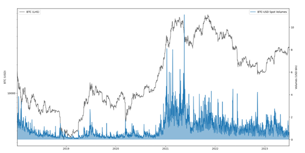
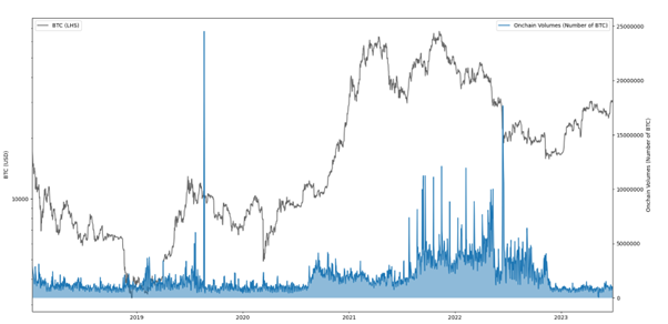
We would want to see a more sustained uptick in spot volumes, as we started to see in early 2023. Similarly, we can apply the same idea to on-chain volumes, which act as a proxy for market activity by on-chain entities. Together with exchange volumes, on-chain volumes help us get a rough idea of market activity of Bitcoin.
On-chain volumes for Bitcoin have been even more muted than spot exchange volumes, especially since the market bottom in November 2022.
Figure 27: Bitcoin On-Chain Volumes
Moving beyond the spot volumes, derivatives have been growing in terms of market dominance over the last few years, with the derivatives market now occupying 77.6% of the entire crypto market, an all time high for the market share of derivatives, highlighting the increase in use of leverage.2
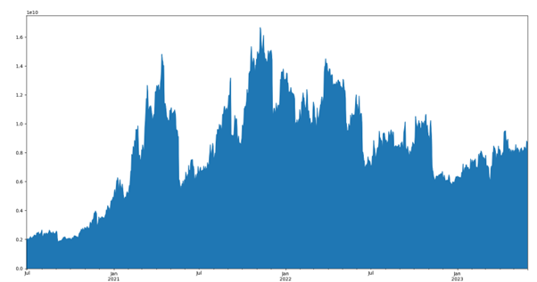
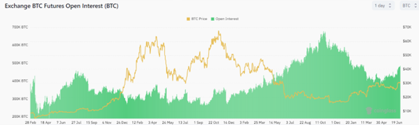
Looking at futures Open Interest for Bitcoin, the open interest levels (USD terms) are back at pre-FTX levels (i.e. before November 2022). Still, it is nowhere near early 2022 levels.
Figure 28: Bitcoin Open Interest
Open Interest for Bitcoin (expressed in Bitcoin terms) did elevate significantly in early Q4 2022, but has since been on a relative downtrend, in-spite the price rise of Bitcoin.
Figure 29: Bitcoin Open Interest (in Bitcoin terms)
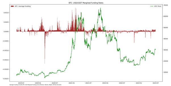
All of this indicates that there are low levels of leverage in the market. This is further confirmed by funding rates. Funding rates act as a proxy for potential leverage deployed in the ecosystem via futures. Large positive funding rates indicate that derivatives traders are bullish on the current market prices as traders are willing to pay a lot of money to go long Bitcoin in the hopes of profiting from upward price moves. Conversely large negative funding rates usually occur during when there is low market sentiment, typically around market bottom events, as people pay to short Bitcoin in hope of profiting from further price falls.
Figure 30: Bitcoin USD / USDT Margined Funding Rates
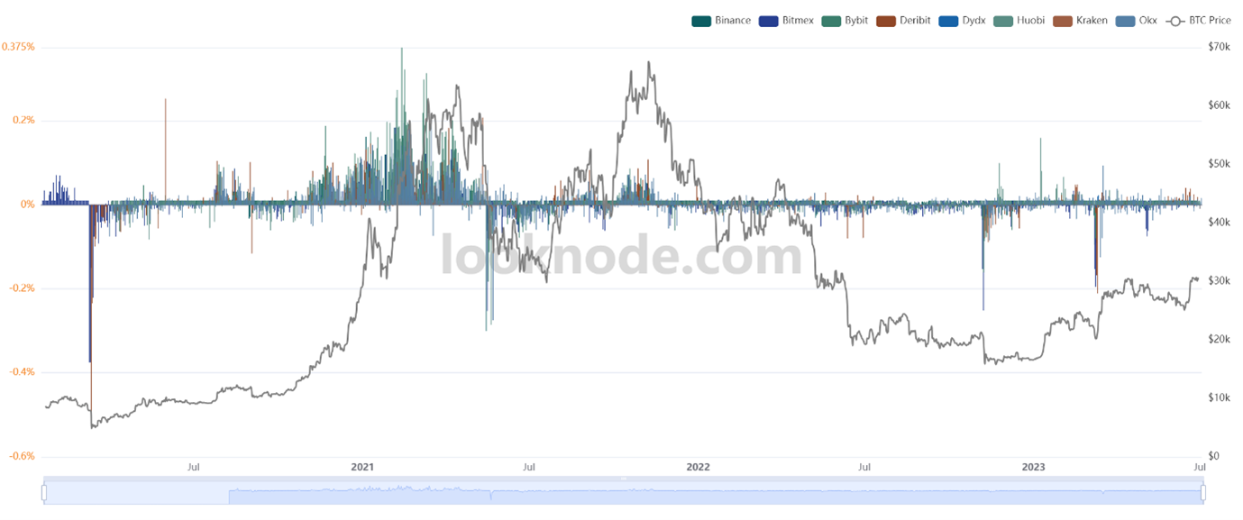
Coin margined funding rates provide similar information, telling us about the same scenario, but indicates the amount of leverage deployed by traders with collateral posted in crypto collateral (excluding stablecoins). A high level of coin margined funding rates relative to USD margined funding rates indicates potential for more volatility in the short term. Currently, coin margined funding rates are very muted.
Figure 31: Bitcoin Coin Margined Funding Rates
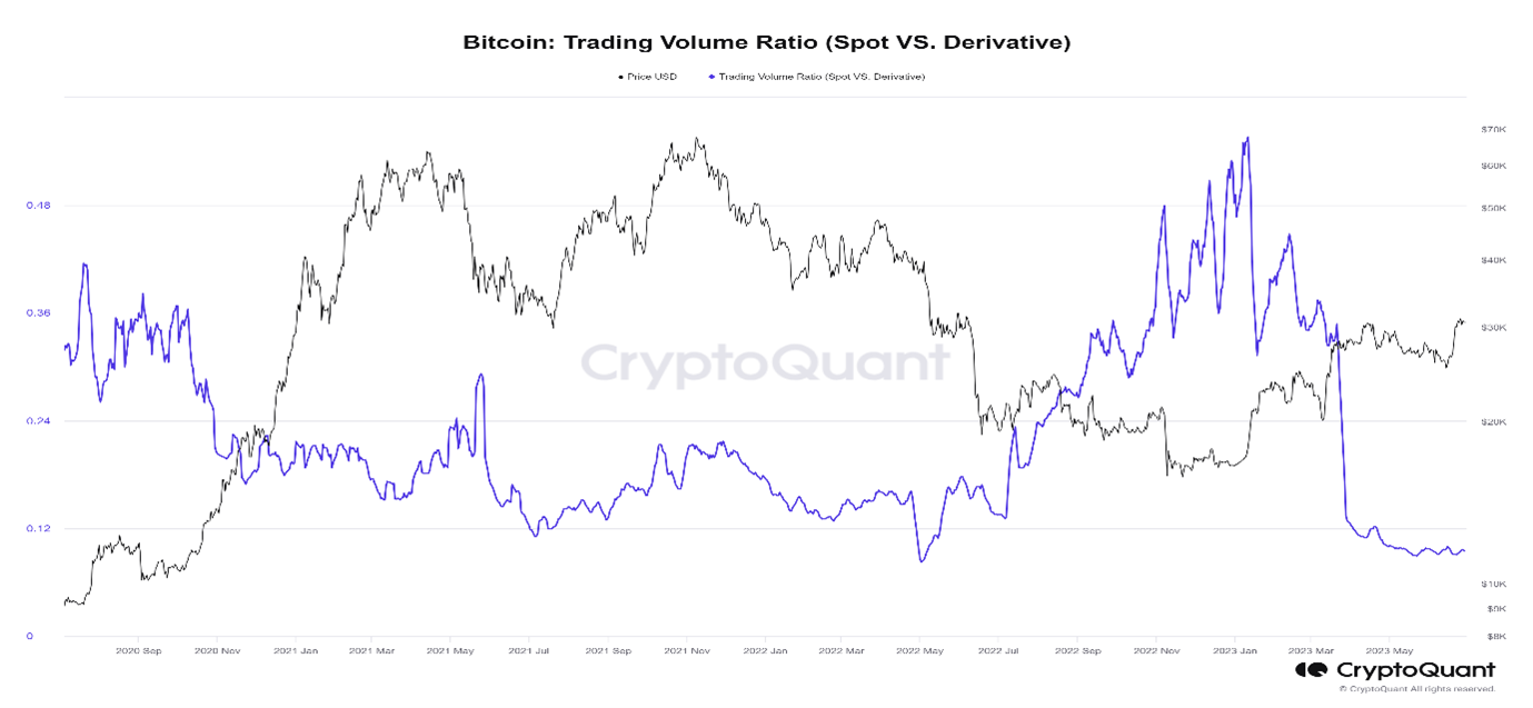
The Bitcoin spot vs derivatives volumes chart below shows that spot trading volumes has seem a large increase relative to derivative trading volumes.
Altogether, this and the charts above suggest that the Bitcoin price rally in early 2023 seems to have been led by spot buyers and not futures buyers or leverage. Spot demand tends to correlate more closely with fundamental and long-term demand, as shown by the chart below and not by leverage less likely by traders and short-term speculators. This is consistent with a sustainable transition out of a bear market.
Figure 32: Bitcoin Spot vs Derivatives Volumes Ratio
Conclusion
Overall, the data is consistent with previous crypto market cycles. If the crypto market evolves in a similar way as previous market cycles, we can have confidence that we are in the transition phase out of the 2022 bear market and into the next crypto bull market.
Bitcoin on-chain bottom metrics, which have been relatively successful in identifying market bottoms in the past, essentially bottomed out by the end of last year. This indicates that a market bottom has likely been established, notwithstanding a black swan event.
What typically follows a market bottom is a slow grind up in market activity, both on-chain and on exchanges, typically with spurts of high price action. If the crypto market were to follow a similar path to past crypto market cycles, we would expect market activity to continue being muted with Bitcoin leading the market into a full-fledged early stage bull market. This is then followed by altcoins experiencing an increase in inflows and activity on-chain, as the bull market matures.
Footnotes
1 For more information, please refer to Is the Bitcoin Bear Behind Us? (glassnode.com)
2 For more information, please refer to 645b810b7130f935bc373feb_Exchange Review April 2023.pdf (website-files.c om)
Haftungsausschluss